Slough Urban Renewal
Slough

Few places in Berkshire have a reputation as mixed as Slough’s. Strip back a few decades and you’ll find Poet Laureate John Betjeman’s honest words: ‘Come friendly bombs and fall on Slough! / It isn’t fit for humans now…’ rang true for many who lived there.
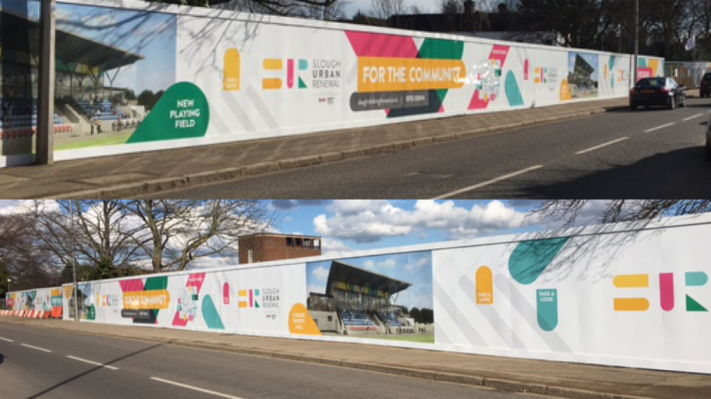
The perception of Slough had to change. It needed regenerating; a makeover that would make it into what it is today: one of the top places to live and work in the UK. So when the town’s long-awaited £1bn facelift was announced, Slough Urban Renewal knew that residents and workers would want to know and feel included in the project. And that’s when they asked us to step in.


Their request was an identity that would help generate interest and excitement around the makeover, and all the possibilities that a ‘new look’ Slough would have. So, with the grey concrete of Slough literally being our blank canvas, we knew that eye-catching colours would be vital in engaging with and reflecting the town’s diverse community, and a way of giving Slough a vibrant and attractive personality.


Like shining a torch in a dark room, the colourful campaign and its accompanying stoic messaging was unmissable. It was big. Bold. Optimistic. It communicated change positively – whether it was on posters or on online – without cockiness or any hint of brashness. And this new identity has confidently made its presence felt throughout Slough, and has given a new lease of life to the community and beyond.
4th Floor,
80 Holdenhurst Rd,
Boscombe,
Bournemouth
BH8 8AQ
151 Rosebery Avenue
London
EC1R 4AB
Unit 2, Lee Road
Glasnevin
Dublin 11
Amsterdam Atrium
Strawinskylaan 3051
1077 ZX Amsterdam
3rd Floor
888 Huashan Road
Shanghai
Sheikh Khalifa Bin Zayed Road
Burjuman Business Tower
18th Floor
Bahnhofplatz 6
Erlangen 91054
Germany
5/F Central Plaza
18 Harbour Road
Wan Chai
Büyükdere Cad. No: 201
Levent Loft Residence D: 132
34394 Levent
Building B, 2nd floor
New Market Road
Northlands Corner Retail Centre
Northriding 2162
Surian Tower, Level 4,
Unit 4.1, 1, Jalan PJU 7/3,
Mutiara Damansara, 47820 Petaling Jaya, Selangor
95 Bluxome Street
94107
578 Broadway FL 7
New York NY 10012
Saint Lazare
26-28 rue de Londres
75009
Building G
BB Centrum
140 00 Prague 4
Michelska Street
Alameda Santos, 1000
5h floor – Sao Paulo
01418-902
46 Kim Yam Road,
The Herencia
#03-19 Singapore
239351
160 Bloor St E
Toronto
ON, M4W 3R2

 Inspiration station #01
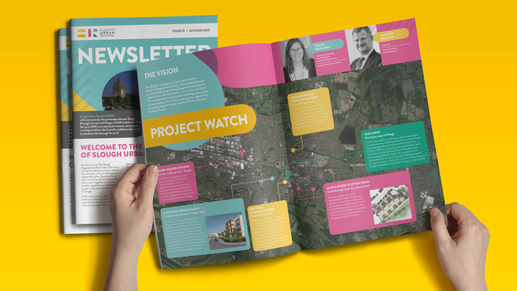