The Future of Property Websites
Disclaimer: this article discusses the future of web without defaulting to the three dreaded acronyms; AI, AR and VR. If I were to give examples of the future of property websites, those could easily fill gaps and make my life easier. They’re carving a place for themselves in this world, but it’s still early days and they need a genuine reason for spending time and money developing.
Digital’s place in the property industry is complex. It’s a product-based world, but those products range from £150,000 to £10,000,000. Adopting an eCommerce model like Amazon or ASOS would be tricky, as you don’t have next day delivery or free returns. For the amount of debt someone’s about to put themselves in to have one of your products, they’re going to want to experience it first. So, in a world that relies heavily on physical interaction, how do you define digital’s role in a customer’s experience?
Simply, choose your moments wisely and constantly ask the question ‘what’s the point?’
We’re here for a good time, not a long time
With most property sites, its normal to load it with everything you’ve got, neatly organise it in a logical order and hope users find what they’re looking for. We can try and steer them in a preferred direction but, with so many rabbit holes to disappear through, we’re going to lose potential customers through their own curiosity. Or worse, their frustration at not finding their desired information in the ocean of content out there… which is our fault.
With attention spans stretched thin, people don’t want to spend their time sifting through content. We need to guide them and entice them into engaging with us. If we can evoke a positive emotional response, we give our customers a reason to get in touch and find out more.
Pageless design
So, you have a story you need to deliver it in a way that cuts deep, but this doesn’t mean you should force your beautiful story into a predefined square. Instead, design the page around it with ‘Pageless design’, or a one-page website.
As you’re only having to create one page, they’re quicker and cheaper to produce than your typical website. Their size forces you to select the most relevant information for customers and their nature guides them through your narrative, with fewer of the aforementioned rabbit holes.
Accelerated Mobile Pages
While we’re moving towards a superfast 5G connection, websites are getting hungrier, eating into our consumer’s data with 4K video, infinite image galleries and more javascript files than content on the pages they control. Additionally, emails have been stuck in the dark ages for too long, offering minimal flexibility while we crave something more interesting to clog up our inboxes. But, lucky for us, AMPs will change the way we build websites and emails.
“Provide a user-first format for web content, supporting the long-term success of every web publisher, merchant, and advertiser.” – https://amp.dev/AMP
Google’s AMP vision is what we’ve been trying to fudge current tech options into, and their killer point is: ‘When in doubt, do what’s best for the end user experience, even if it means that it’s harder for the page creator to build or for the library developer to implement’.
Web pages load faster, get better rankings in Google and have engaging elements to explore. They don’t cover every conceivable creative solution, but their use can have a major impact.
We’re starting to see email adopt AMP, which means content delivered to customers is far more efficient. It’s still early days for the use in email, as there are too many email clients we need to catch up, but it’s promising nonetheless.
Iterate
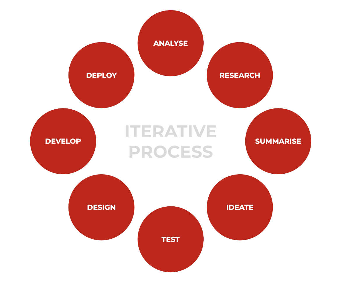
Reviewing and improving your website is an overlooked and undervalued process. User testing, researching and personal aesthetic choices prior to a site launch will only go so far, that the only way you’ll ever learn about your users is to monitor them in action.
There are so many tools at our disposal to make the process of gathering information easy, that the difficult part is how you interpret that information and find solutions to your user’s problems. But, don’t rely on just one source of information.
For example, Google Analytics could be telling you a high proportion of users are leaving your site from a specific page. You’d assume this page is the issue, however, by using multiple tools, it’s revealed that the real issue is with the page that took them there. They click through expecting more information and did not find any, therefore they leave. It’s information like that you can rarely encounter or account for prior to your site launch, as it relies on real people and their variation of behavioural patterns.
To remedy this, get your site live based on the best information available to you, then refine your site in frequent increments based on what you learn about your users.
The beauty of the iterative cycle is that it’s perpetual. What you learn from a previous cycle feeds into the next stage. This can be done once, infinitely or anywhere in between.
The skill of a site is to find balance, as there’s a fine line between daunting information overloads and content desolation, leaving people confused. Provide enough information to intrigue users, giving them a reason to begin a line of communication. The rest comes down to timing. With any digital touch point, the aim has always got to be getting customers through the door to have a physical experience in a product. No digital experience will ever trump that, and why would we want it to?
George Russell – Head of Innovation
January 2020


